Understanding your canvas
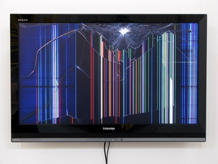
Vector screens
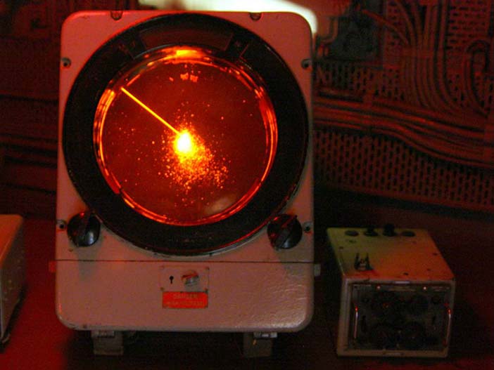
Vector screens do not really use pixels to define an image, instead they work more like an oscilloscope. By deflecting a beam that swipes very fast through the screen to form images. Here you can see the Vectrex, a video came console that used vector graphics on a vector screen. You can still see some of this in vintage videogame parlours. All the graphics in the classic game Asteroids were made this way.
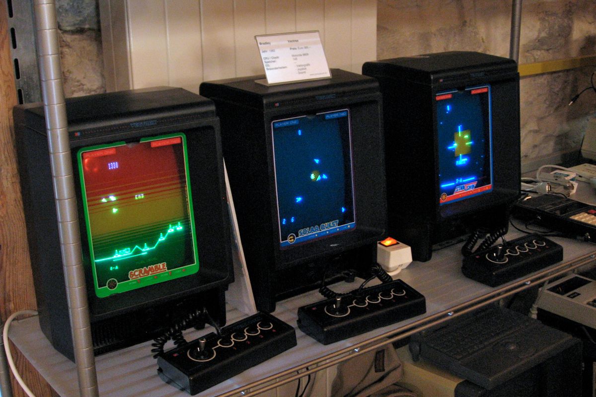
These types of screens are monochromatic, they can't really display color. The Vectrex addressed this by adding transparent plastic overlays that added color to the play area. Some games shipped with their own overlays that you could place on your screen to add color to the game.
This approach to graphics is still is use today, although it is admittedly a bit geeky. This is more recent work made in Processing using an oscilloscope.
XYScope is a library for Processing to render graphics on a vector display (oscilloscope, laser) by converting them to audio. Ted Davis XYscope instagram
The method used by vector screens (a deflected beam) is also how lasers (in clubs for example) continue to work. A laser as a device used to present graphics is basically a continuous beam deflected (at very high speeds) by two mirrors that control the X and Y position of the beam in two dimensions.
This is the result of a workshop on generative typography in the Basel School of Design by glitch-artist Ted Davis. It is a good example of the combination of both, vector and raster graphics. Lasers work very similarly to vector display systems, with mirror deflecting the beam in the X and Y at great speeds axis to form an image. The refresh rate of laser is quite poor though as the deflection is mechanical.
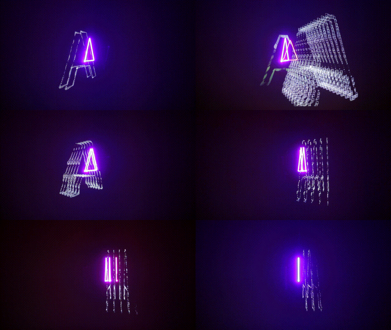
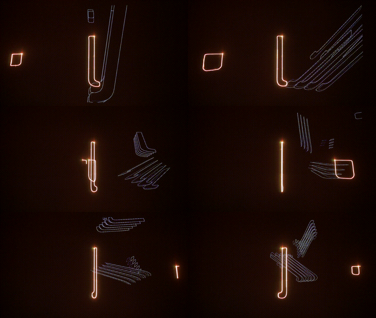
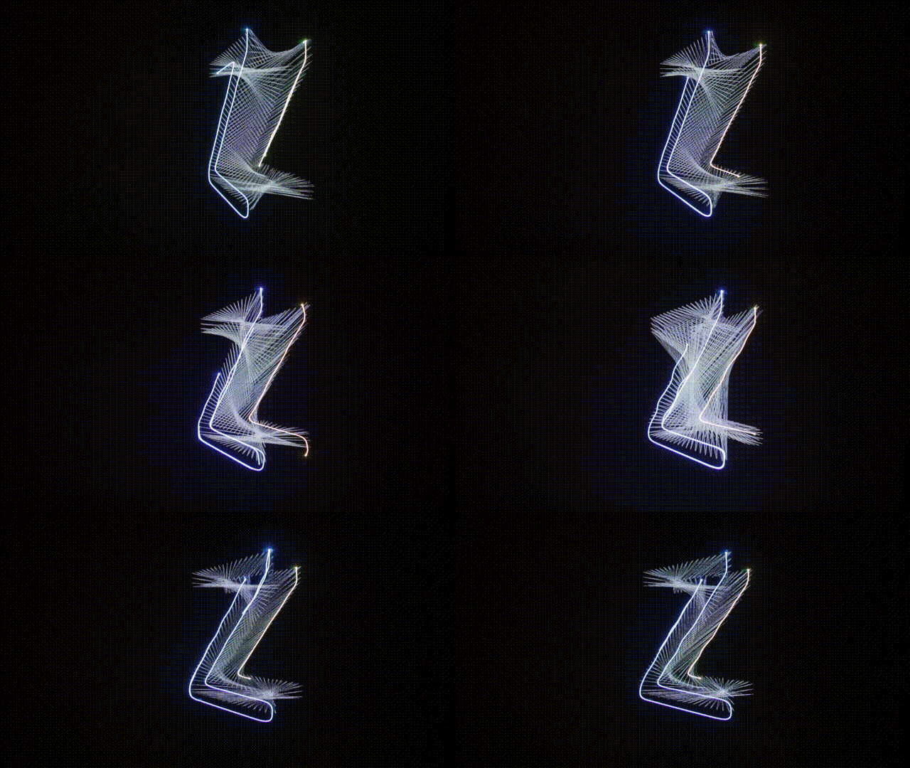
LASER LETTERS II from ffd8 on Vimeo.
Raster screens
The advent of CRT (Cathode Ray Tube) brought a more efficient way of displaying flat images at faster speeds (higher refresh rates).
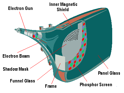
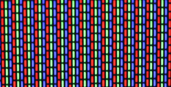
Vector vs. Raster
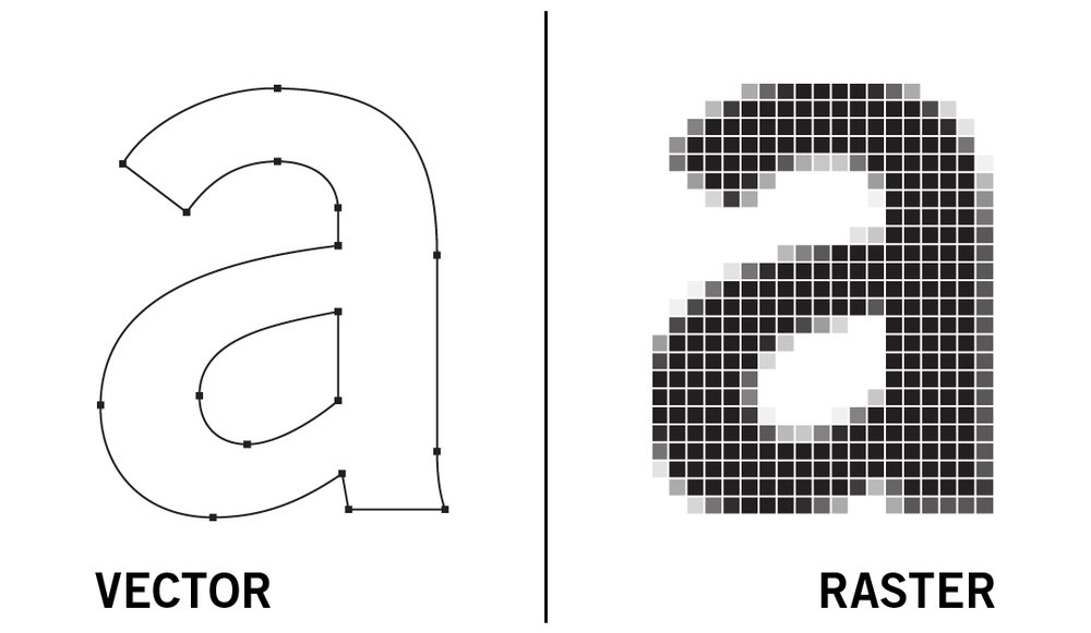

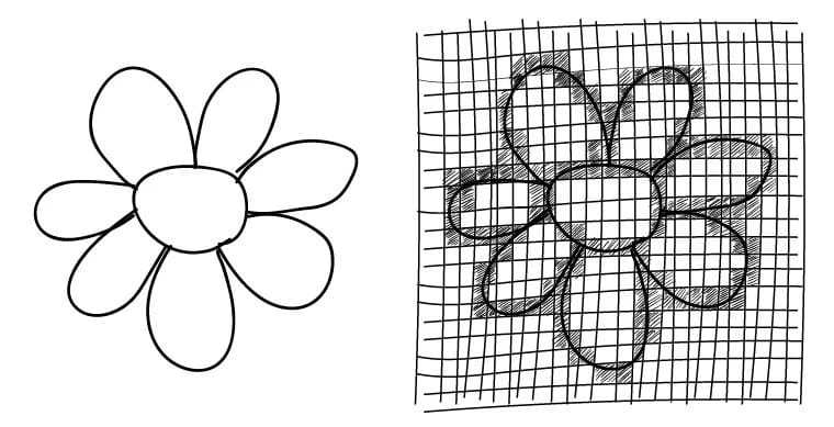
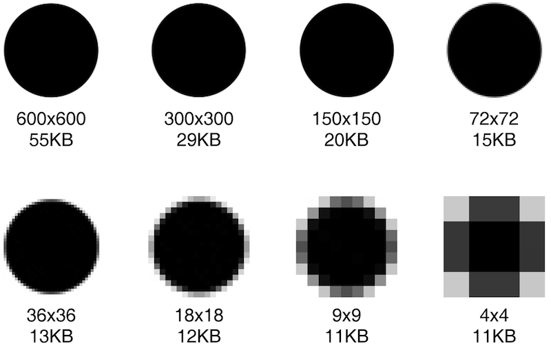
Screen form factors
Screens haven't always been rectangular. In fact the form of a screen used to be much more closely related to the form factor of the product. With the mass production of rectangular screens, this practice is not so common anymore. These days is mostly products marketed as "luxury" have non-rectangular form factors today.

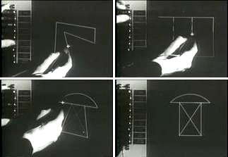
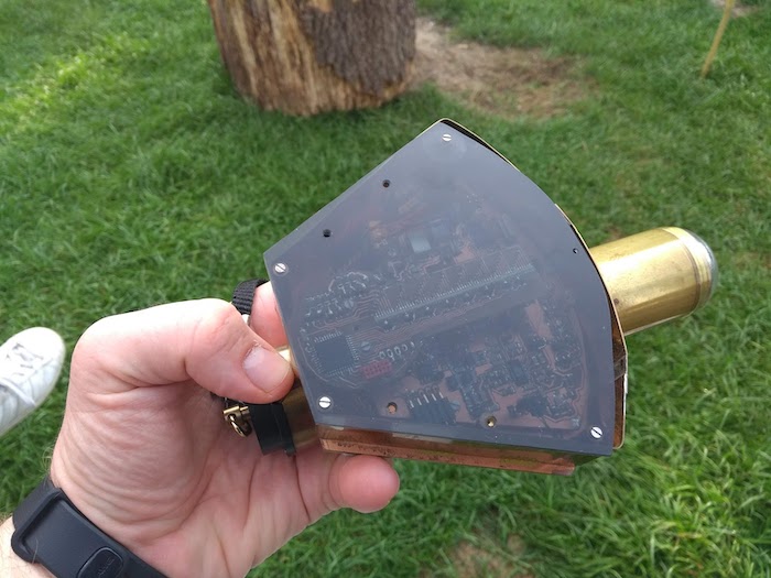
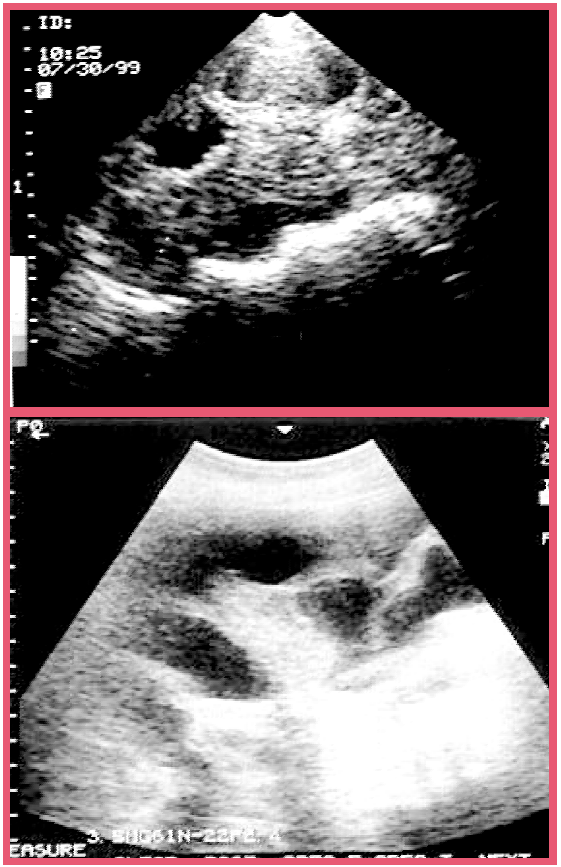

The Black Mirror
Screens have become such a pervasive presence in our lives that we almost expect them to be the support for all the images we encounter today.
The title of the Black Mirror series by Charlie Brooker plays exactly on this notion of the screen as a signifier for all technology as the series explores uncanny developments in how people relate to tech.
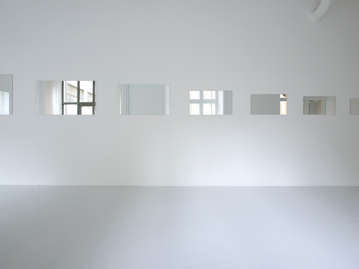

Popular Screen Sizes (60″, 55″, 46″, 40″, 32″, 27″, 24″, 21″, 17″, 15″, 13″, 10″, 7″, 3.5″) installation by Rafaël Rozendaal
The web-browser as a screen
Web-browsers have become increasingly versatile pieces of software, they are able to render a page written in the first spec of HTML in the 1990s, but they are also able to render the latest flashiest web application written with a dozen javascript frameworks. Browsers are hugely complex pieces of software, these days browsers are almost as complex as operating systems.
In this part of the course we will focus mostly on creating appealing visuals through code and sketching our ideas for animations and interactions, there are many ways of going about this and the default browser APIs are definitely sufficiently equipped to deal with most of what we can throw at it. However for this course we will be starting with p5js, there are several reasons for this. Those of you who studied design before might already be familiar with Processing, also Javascript is the de facto standard language for browser-based applications, even mobile apps and it is a good gateway language for other programming language of the same family as C# that we will be seeing later on in the year when we cover Unity.
Pixels
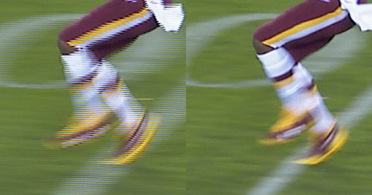
A pixel is tiny picture element in a screen, it is a vehicle used by the screen to deliver to us the experience of a color. They have become so small that we no longer perceive them, but they are still there, as the bricks that form all images in our screens. Screens cannot operate in terms of whole images, they do not understand the general composition of an image. Screens for example, cannot represent how colours are layered in a painting when they display the picture of a painting. In old monitors and TVs, or early videogame consoles the look was determined not just by the pixels of the digital system, but also by the analog conversion used by the display. An old TV is an example of an analog display. Analog display's (similarly to vector displays) represent the world using a beam of electrons that scans the phosphor coating inside of the glass vessel of the screen, this beam travels horizontally along the screen and traces the image is what are known as scanlines.
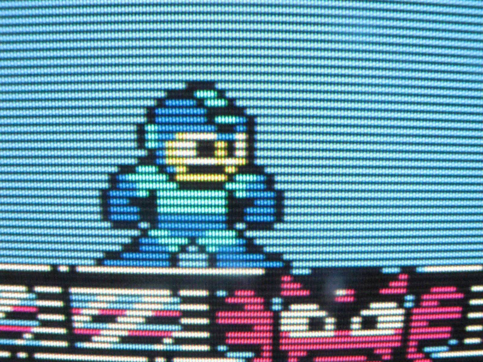
Compare these two images, on the left the image is shown in digital pixels in a digital display system, on the right it is shown in digital pixels using an analog display screen.
![]()
Scanlines give you that instant retro look!
Aspect ratios
Pixels are in fact almost never square. Most pixels are taller than they are wider, but that's not how we perceive them. The dimensions of a pixel are dependant on the screen's resolution.
Resolution
Next to color, resolution is perhaps on of the most complex topics in image perception. Resolution doesn't only refer to the technical fact of how many pixels the screen has in each dimension it has more to do with how the image is constructed in these picture elements. The field of photography had notions of resolution that were very specific to film types and material substrates (density of grains of silver per frame for example). In the digital image the notion of resolution is even more complex. For the purpose of this module we will focus on two aspects of the notion of resolution: pixel densities and screen dimensions.
High-end screens and cameras today arguably have resolutions higher than our visual perception systems can process. Our eyes can literally not process all the information that modern imaging techniques are capable of registering. We can no longer sea all the pixels, our brains merges the visual information into a single smooth image.
If you want to dive deeper into the topic of image resolution and the the implications of shifts in resolutions, have a look at the work of Rosa Menkman, specifically her website Beyond Resolution.
Screen coordinate system
To be able to address pixels and set their color, a digital screen needs to know how to find them in the screen. All digital screens implement a coordinate system. This coordinate system is 2D, the horizontal position of a pixel is determined by the X coordinate and the vertical position by the Y coordinate. Therefore to know the position of a pixel on a screen we use two numbers (X, Y).
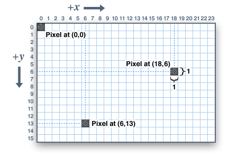
A single pixel is adimensional. We do not say that pixels have widths and heights by themselves, we think of them as single-dimensional dots. Shapes that are made of multiple pixels normally have a width and a height, such as for example a glyph in a typeface or a rectangle.
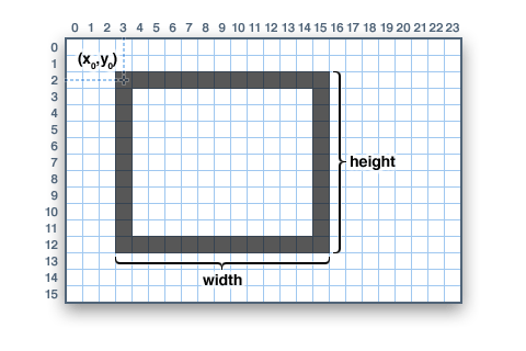
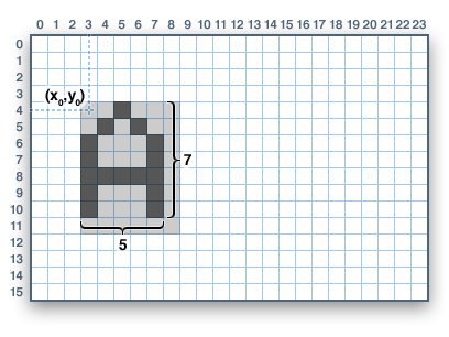
Compositional elements that have 0 or 1 as both their width and height are said to be degenerate and they are normally represented as a single pixel or culled completely from the scene. This is unimportant at this stage, but it is an important role in 3D graphics that aids in the optimization of the render process.
Every pixel has an address, you can consider the address to be the place where that pixel is in memory or the ordinal of the pixel. The address can be calculated as: (y * width) + x. In most tools you will not need to use the address of the pixel. But it will be useful for generative graphics, shaders, and image filtering.
Relationship between browser, canvas and screen
When we are working in the browser, our coordinate system is relative to the canvas where the render operations will occur. This means that we cannot assume that the pixels at coordinate (0, 0) will always be at the top-left of our screen. It will be only at the top-left of our canvas. The canvas position will depend on the browser's window position and the characteristics of the HTML document that contains our canvas, such as margins, paddings, etc. So if you want your graphics to occupy the entire browser window make sure your canvas is correctly set up. We will see how to do that later.
Working with colors
In visual perception a color is almost never seen as it really is — as it physically is. This fact makes color the most relative medium in art.
In order to use color effectively it is necessary to recognize that color deceives continually. To this end, the beginning is not a study of color systems.
First, it should be learned that one and the same color evokes innumerable readings. Instead of mechanically applying or merely implying laws and rules of color harmony, distinct color effects are produced-through recognition of the interaction of color-by making, for instance, two very different colors look alike, or nearly alike." — Josef Albers

Albers' way of naming the visual phenomena arising from looking at colors together, is interaction of colors. He doesn't speak of visual illusions, as if somehow this was a failure of our perceptual systems or a cheap trick conjured by some someone to create confusion, the truth is plainly available to the eye. And the truth is that this interaction is very much the nature of colour, similar colors can be perceived differently depending on their companions in a scene. Color theory, while a useful learning, can be problematic if we apply it methodically without letting the actual visual experience of color guide our composition.
Color mixing systems
In the additive color system, the appearance of a color is determine by different gradations of the primary color components, which in the case of light, and theremore most screens, is based on RED, GREEN and BLUE.
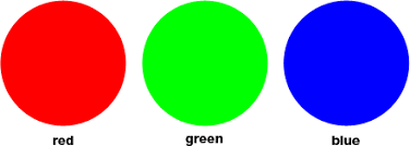
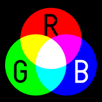
For print processes where each layering of the inks results in less light being reflected back, the substractive color system is more appropriate. In this system the primary colors are RYB (RED, YELLOW and BLUE). This is the color system that you likely learnt in primary school as it is the one most commonly used in painting too. RYB is most appropriate when the pigments actually mix. With modern printing technologies there wasn't as much color mixing as there was layering and for this purpose red and blue where replaced by magenta and cyan sometimes known as "process red" and "process blue", which are more effective at filtering when colors are applied in layers or printed using half-toning techniques. This color system is commonly known as CMY, with K sometimes added for pure blacks in inkjet or other photomechanical printing processes.

For the purpose of this course it is not vital that you master conversions between these two color systems, but it is important to understand that what you make on screen might not look as good in print and that color, and how colors are used in these processes will play a role in that difference in quality. So if for example, you use Processing for a generative poster design and you compose your image on screen, you have to make sure that the correct color system is used before you submit it to print if you want your colors to look right.
How colors are represented in a digital system
Computers represent color by storing bits in memory, a position of a specific bit determines what component of the color and the value of that bit determines how much of that component. This diagram shows how a 32 bit color value is stored in the graphics cards of a computer.


As you can see, computers store color values in binary numbers (ones and zeroes), the hexadecimal number system is a convenient way to represent these color values and this is why in HTML and CSS you have progrably become used to color your compositions by using the HEX color code.
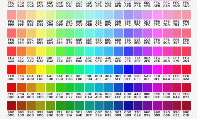
Color spaces
If you think of each color component as a dimension in space, three color components will give you a three dimensional space, as you go along one of the axis the color value for that component will change and so will the color. This illustration shows you the cube formed by all the values in the RGB color space.
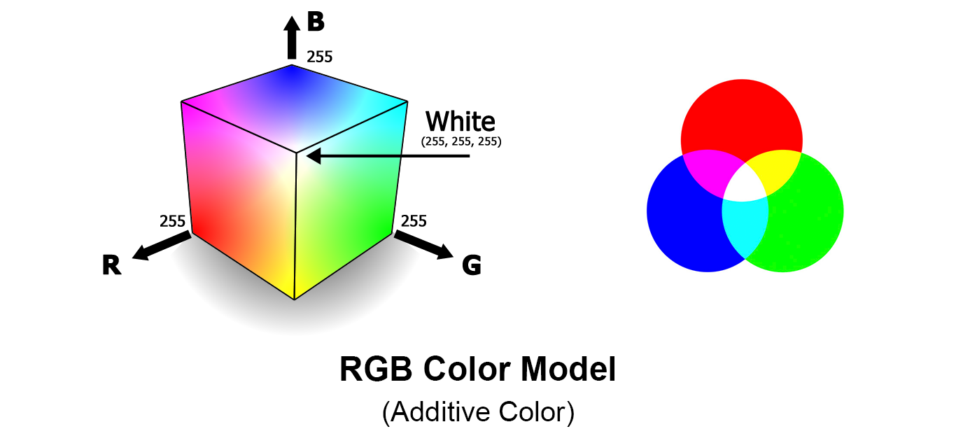
The RGB color space is great for computers, it is a simple way to represent color computationally, but it is not very intuitive to a human. It is hard to memorize exactly that the color components of a lemon yellow are. There are things that are simply a bit harder for people to do in the RGB color space. For example imagine that you pick a bright pink, how to do you easily find a slightly less saturated version of that pink in the RGB color space?
The HSV (hue, saturation, value) color space is a little bit more intuitive for humans to think of digital color. The HUE component determines the actual color component, the SATURATION determines determines how much of the tint for that color you want and the VALUE is how much white or black should be present on that mix.
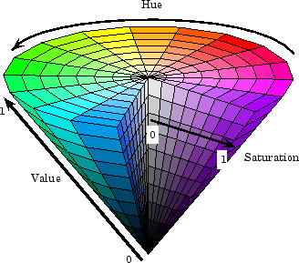
It is possible to convert from one color space to another using some math. The Javascript implementation of this conversion can be found in the appendix.
Cool effects with digital colors
Color cycling or Palette shifting was an animation technique used in 8bit videogames. Have a good look at this site and observe how color can be used to animate and to change the mood of a scene.
effectgames.com tool to explore 8bit color cycling techniques
Exercise: LCD screen teardown
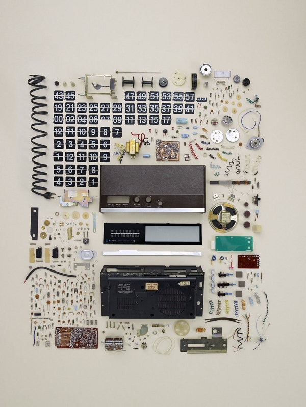
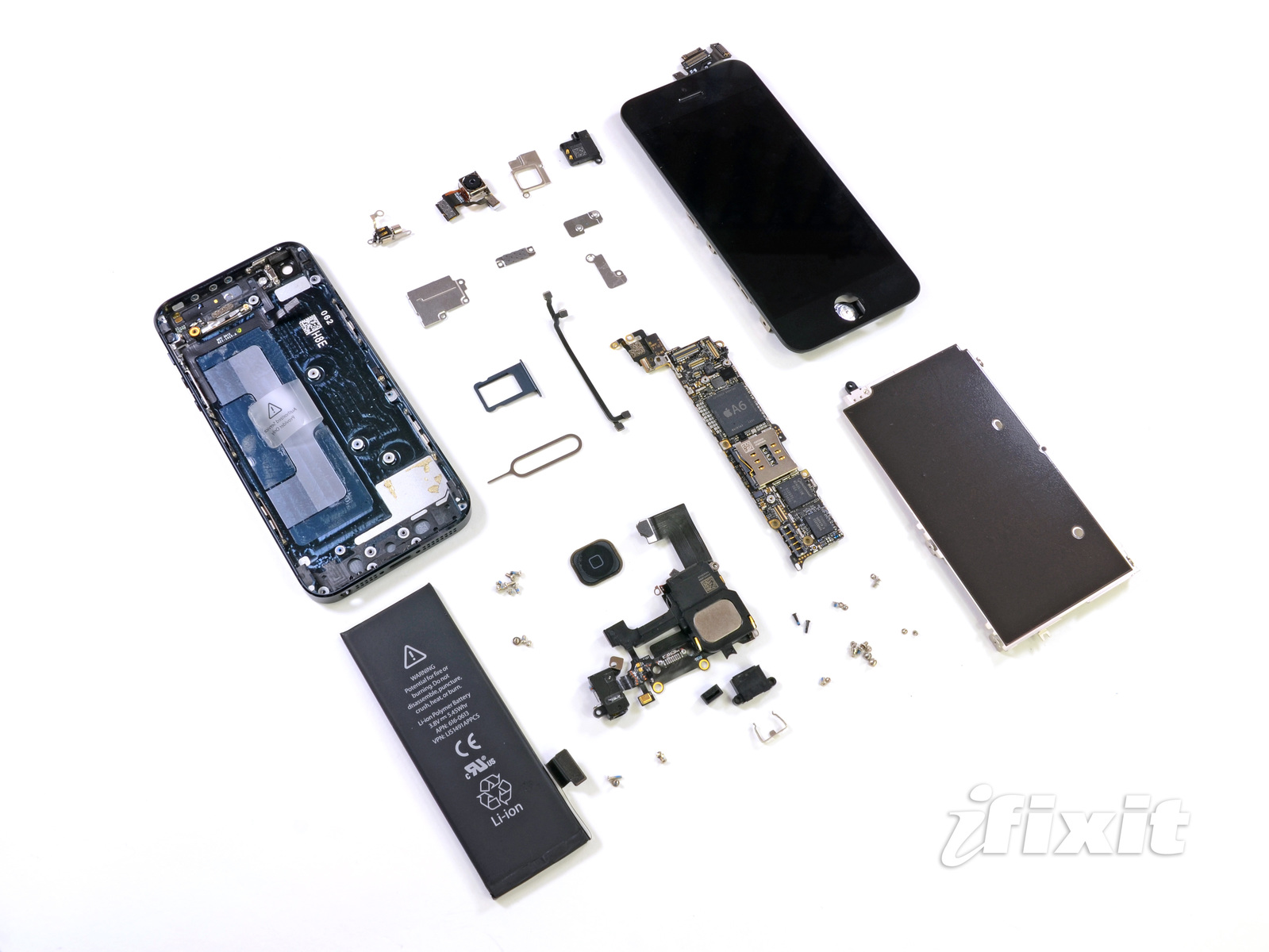
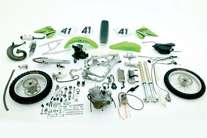
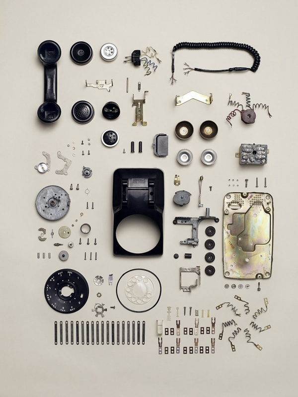
Please form 6 groups and take a screen from the pile. This exercise is about deep observation and understanding of our screen-based canvas. Using screw drivers, pliers and the various tools available in the lab, please take this screen apart. The purpose of this exercise is not to demolish, but to deconstruct. Look at the work of Todd McLellan to get an idea of what I mean. Try to take things apart carefully without breaking them if you can.
As you take the screen apart and come across it's insides ask yourself:
- how is this put together?
- how are these pieces fastened to each other?
- how do the wires stay in place?
- how do the mechanical parts move? how does the swivel work?
- what connectors are exposed?
- what each the function of each part?
Document every step and every part using photography or video. Create a document on Gdrive, or Github wiki or Notion, wherever is most convenient for you to collect your material.
Use a search engine to understand each part, try to learn more about it, maybe how it does what it does or how much it costs or what else you can do with it or where it comes from. Important as well is: how to dispose of it properly! you will be needing that later.
Look for projects or alternative uses for old screens and learn more about alternative uses for these parts. Link to documentation of these projects. Try to arrange the information you come across in a coherent way.
Tools
The following tools will help you in choosing colors for your works:
- Colordot HSL linked to mouse position let's you quickly build palettes
- Adobe Color CC implements auto palettes
- Pantone Color Finder doesn't always make sense to use Pantone in digital palettes (Pantone is meant for pigments, not for additive colors, e.g. you can't have gold color on screen but you can have a gold ink pigment)
- Colourco.de similar but has tools for pairing colors
- Coolors.co decent at finding shares, too bloated for my taste
Further reading
Acknowledgements
The artworks used to illustrate are low-res images from works by Maze de Boer and Rafael Rozendaal, obtained from the artists own portfolio websites. Thanks!
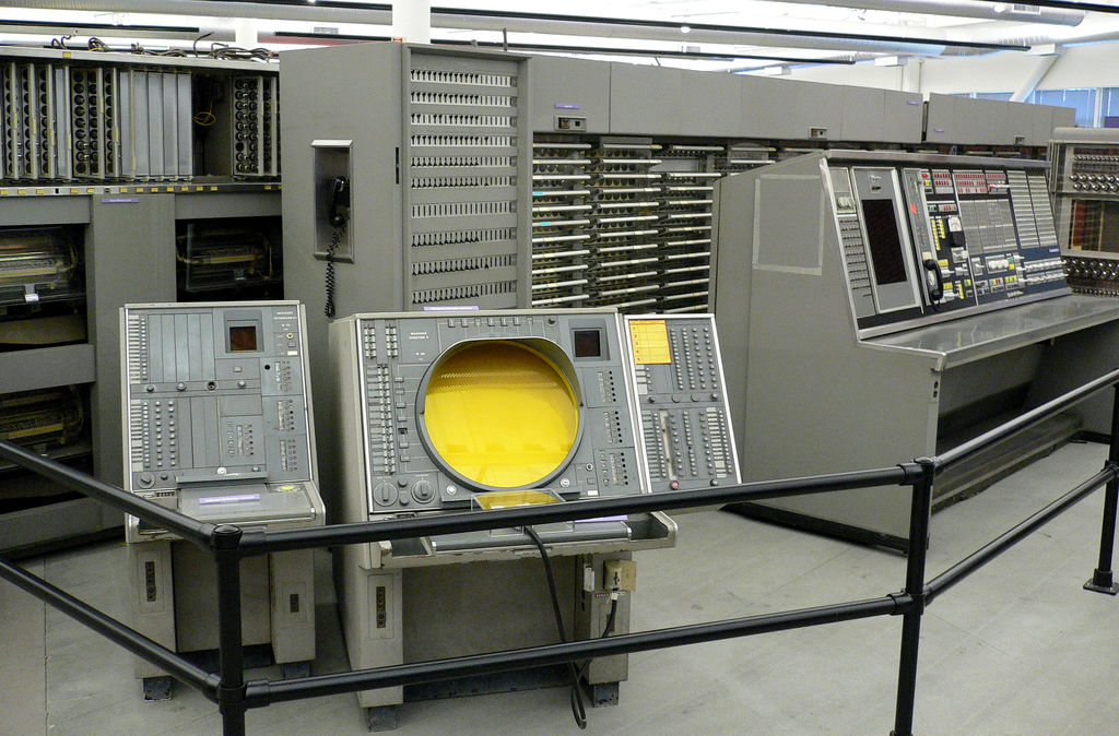
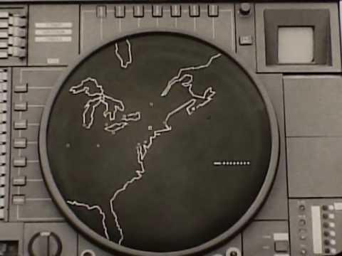
Images from IBM's SAGE system were obtained mostly from this article in ExtremeTech. Thanks!
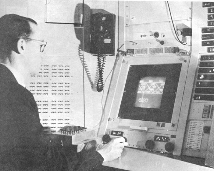
Other SAGE images from this Atlantic article.
Laser typography animates gifs from CreativeApplications.net page on Ted Davis workshop. Page of glitch-artist Ted Davis
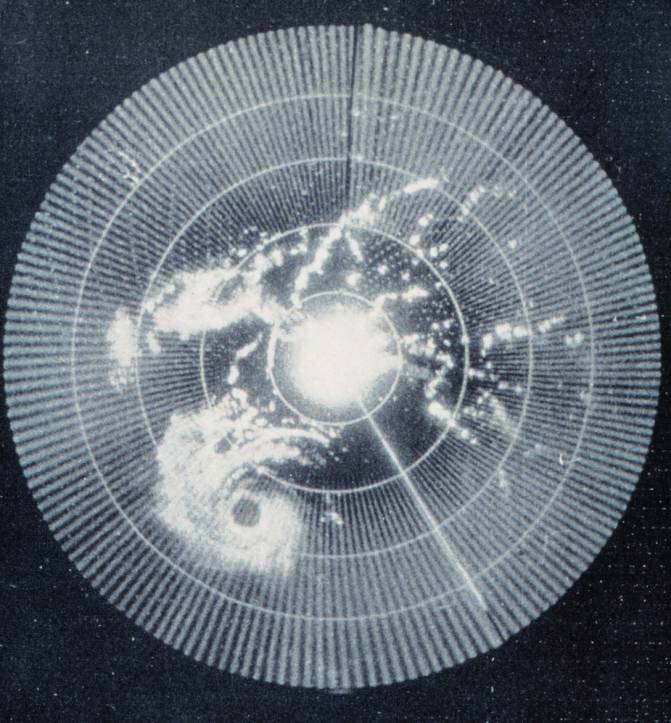
Images of radar screens and XT-2 are all from the excellent Encyclopedia of Human-Computer Interaction, 2nd Ed.. Thanks a lot!