Microinteractions
What are they?
Microinteractions are contained product moments that revolve around a single use case—they have one main task. Every time you change a setting, sync your data or devices, set an alarm, pick a password, log in, set a status message, or favorite or “like” something, you are engaging with a microinteraction. They are everywhere: in the devices we carry, the appliances in our house, the apps on our phones and desktops, even embedded in the environments we live and work in. Most appliances and some apps are built entirely around one microinteraction.
What are they good for?
Microinteractions are good for:
- accomplishing a single task
- connecting devices together
- interacting with a single piece of data such as the temperature
- controlling an ongoing process (e.g. silencing a call by turning your phone around)
- adjusting a setting
- viewing or creating a small piece of content like a status message
- turning a feature or function on or off
Some examples
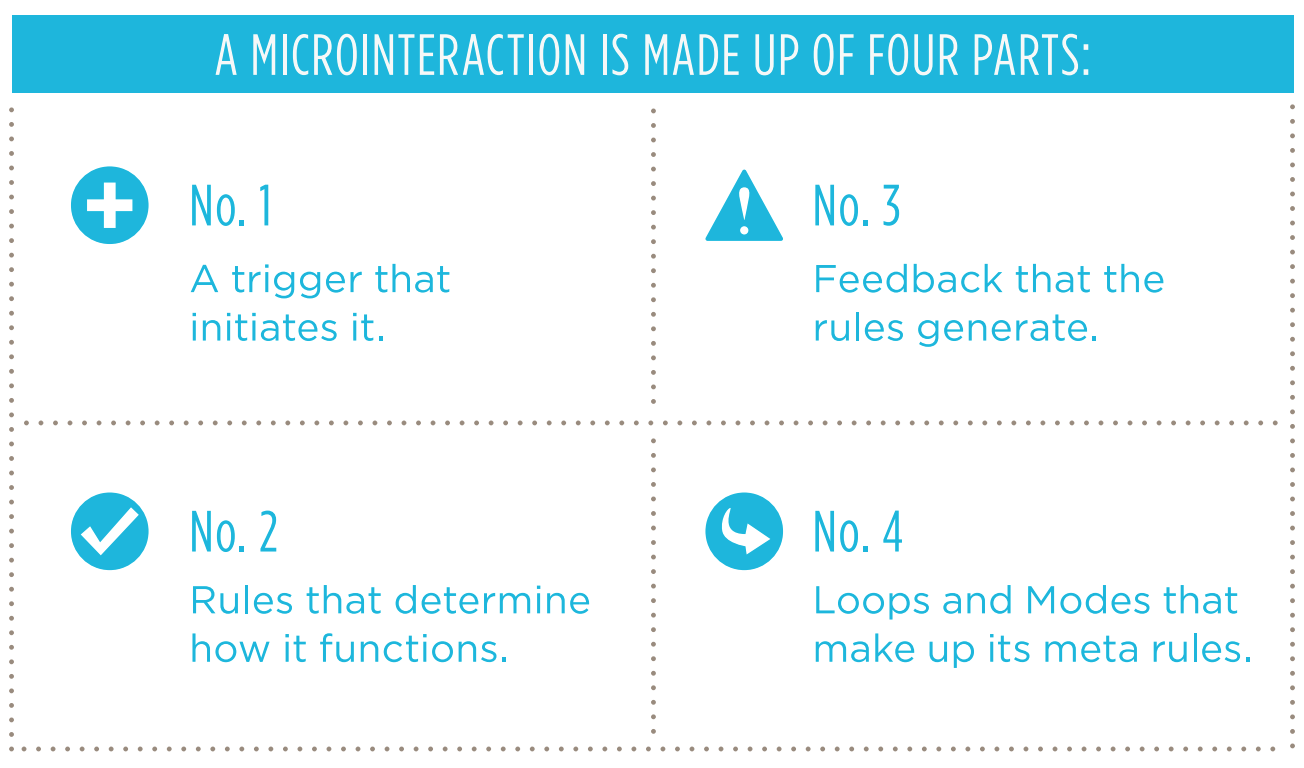
Anatomy of a microinteraction
Some more examples
ICQs sound
AOL's "You've Got Mail"
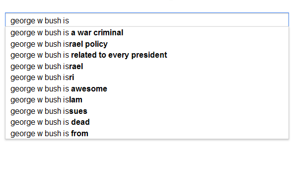
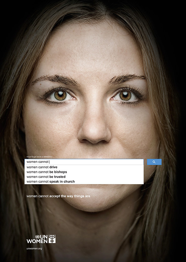
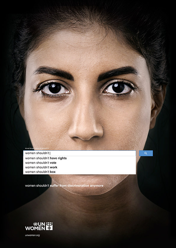
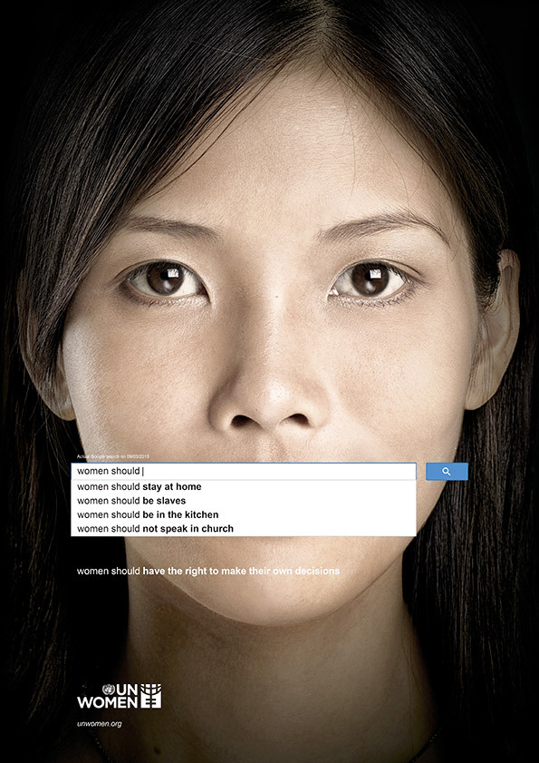
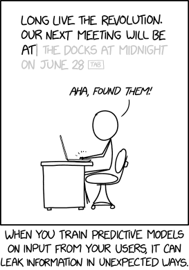
Autocomplete


Autocorrect
The notion of autocorrect was born when Hachamovitch began thinking about a functionality that already existed in Word. Thanks to Charles Simonyi, the longtime Microsoft executive widely recognized as the father of graphical word processing, Word had a “glossary” that could be used as a sort of auto-expander. You could set up a string of words—like insert logo—which, when typed and followed by a press of the F3 button, would get replaced by a JPEG of your company’s logo. Hachamovitch realized that this glossary could be used far more aggressively to correct common mistakes. He drew up a little code that would allow you to press the left arrow and F3 at any time and immediately replace teh with the. His aha moment came when he realized that, because English words are space-delimited, the space bar itself could trigger the replacement, to make correction … automatic! Hachamovitch drew up a list of common errors, and over the next years he and his team went on to solve many of the thorniest. Seperate would automatically change to separate. Accidental cap locks would adjust immediately (making dEAR grEG into Dear Greg). One Microsoft manager dubbed them the Department of Stupid PC Tricks.
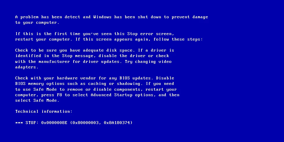
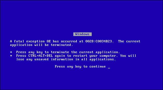
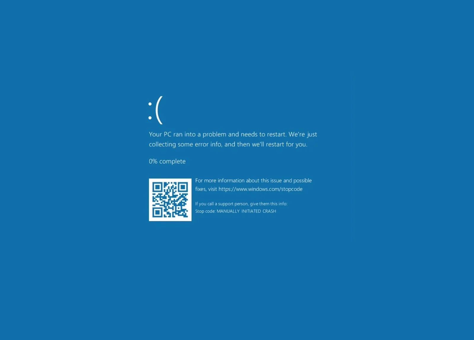
Blue Screen of Death (BSoD)
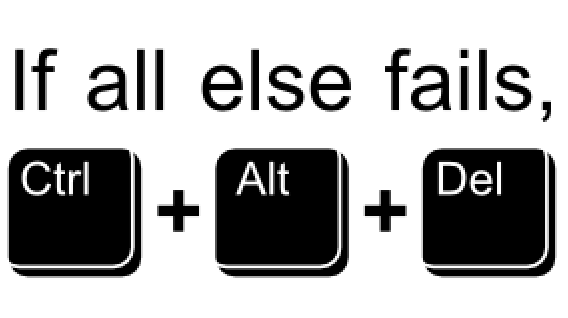
Ctrl+Alt+Delete
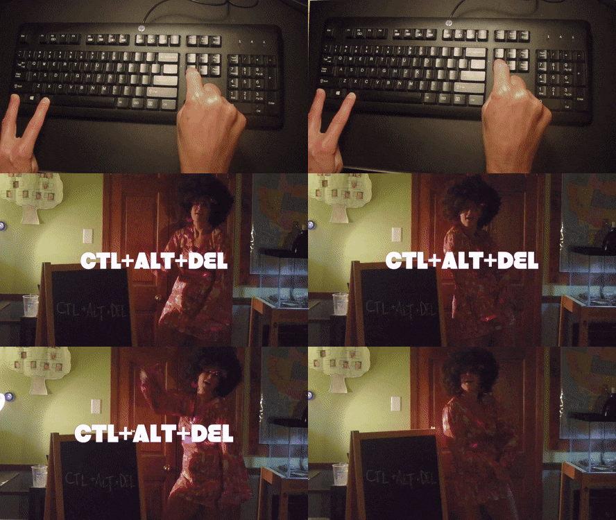
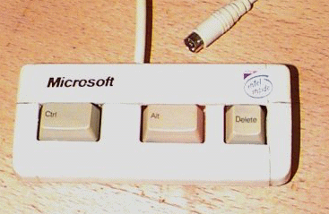
“It was a mistake,” Gates admits to an audience left laughing at his honesty. “We could have had a single button, but the guy who did the IBM keyboard design didn’t wanna give us our single button.” David Bradley, an engineer who worked on the original IBM PC, invented the combination which was originally designed to reboot a PC.
also known as the three finger salute
Copy and Paste (Ctrl+c ad Ctrl+v)
In 1974, a young engineer named Larry Tesler began working on an application called Gypsy for the Xerox Alto computer. Gypsy was one of the first word-processing applications ever, and the successor to the groundbreaking Bravo, the first true WYSIWYG word-processing program and the first program that could have the ability to change fonts. Even though it was still a word-processing program, Gypsy was a different kind of application altogether: it made use of a mouse and a graphical user interface (GUI). Larry’s mission—and what would become his rallying cry for decades to come—was to reduce the modality of the interface, so that users wouldn’t have to switch to a separate mode to perform actions. (His website is http://www.nomodes.com, his Twitter handle is @nomodes, and even his license plate reads NOMODES.) Larry wanted users, when they typed a character key, to always have that character appear onscreen as text—not an unreasonable expectation for a word-processing application. This wasn’t the case in Bravo: typing only worked in a particular mode; other times it triggered a function.
One of those functions was moving text from one part of the document to another. In Bravo, users had to first select the destination, then press the “I” or “R” keys to enter Insert or Replace modes, then find and select the text to move, then finally press the Escape key to execute the copy. Larry knew there was a better way to perform this action, so he designed one that not only made use of the mouse, but radically simplified this microinteraction. In Gypsy, the user could select a piece of text, press the “Copy” function key, then select the destination, and finally press the “Paste” function key. No mode required. And thus, cut and paste was born.
— from Microinteractions
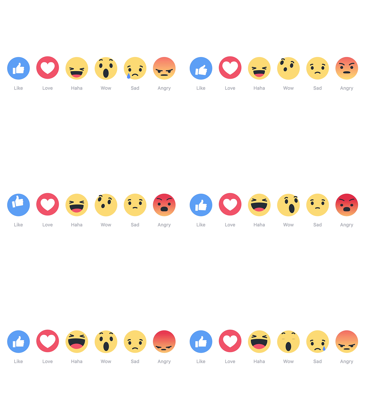
Facebook's Like
Swiping left/right on Tinder
Hamburger menu
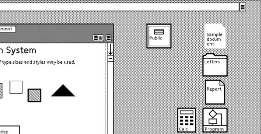
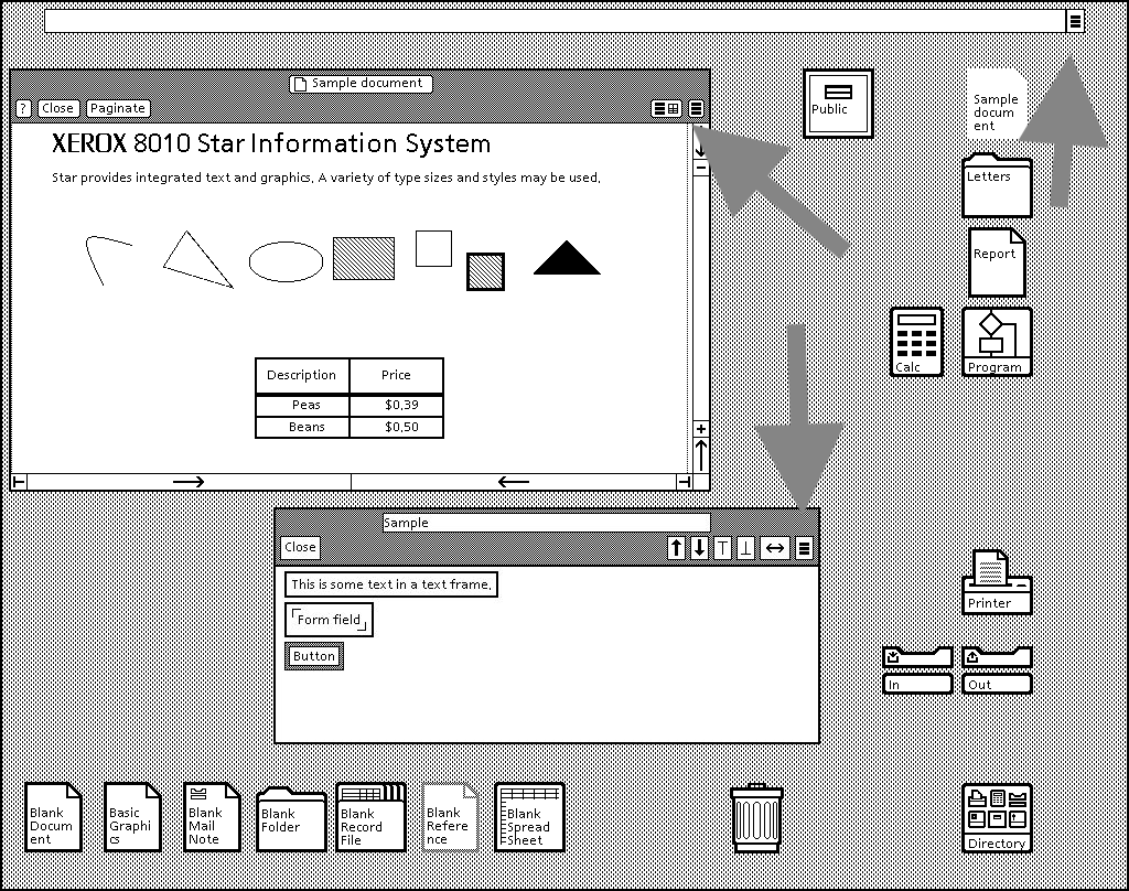
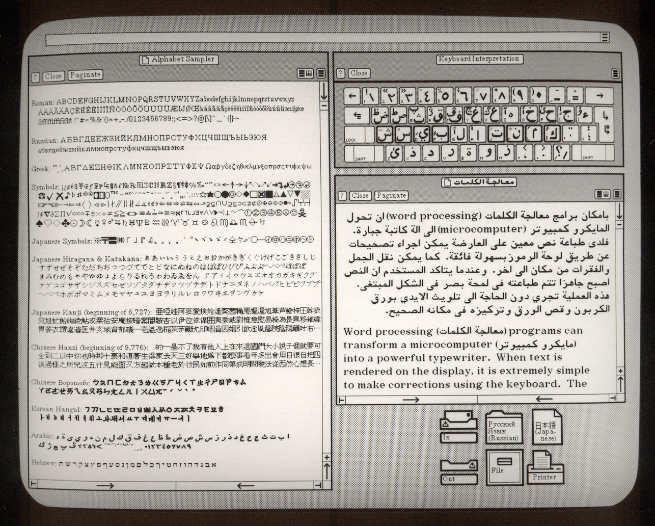
It turns out that the burger comes from the Xerox “Star” personal workstation, one of the earliest graphical user interfaces. Its designer, Norm Cox, was responsible for the entire system’s interface—including the icons that would effectively communicate functionality to the earliest computer users. The hamburger, which looks like a list, seemed like a good way to remind users of a menu list.
Pull to Refresh
Why make the user stop scrolling, lift their finger, then tap a button? Why not have them continue the gesture that they are already in the process of making? When I want to see newer stuff, I scroll up. So I made scrolling itself the gesture.
Scrollbars
It was first implemented at Xerox’s Palo Alto Research Center as part of the Smalltalk operating environment that was installed on the lab’s bitmapped computer systems. “I first saw it there around 1975,” says Larry Tesler, then a PARC researcher. “There were no arrows—just a bar with an elevator. You clicked above or below it to move a chunk of text.”
Typing Indicator in Chat
A good chunk of communication is knowing when it is and isn’t your turn to speak; on a half-duplex line (where only one person can speak at a time) like a walkie-talkie, you really do have to say “over” to make sure your partner doesn’t miss anything. But latent full-duplex (where people can talk at the same time but transmission is delayed until you, say, hit Enter), like instant messaging, has its own problems. If your chat partner’s gone silent, it might be hard to know whether they were typing some huge message or if she was waiting for you to say something. We couldn’t enforce any particular etiquette among users, hence the typing indicator.
Acknowledgements
This session is almost entirely drawn from Dan Saffer's microinteractions.com. Thanks a lot for the excellent resource!
Images from the UN's autocomplete campaign come from It Is Nice That. Thank you!