Disney's twelve basic principles of animation
In 1981 Disney animators Ollie Johnson and Frank Thomas described twelve principles of animation used at Disney studios, these principles still hold true today and have application in various fields like motion graphics, UI design, CSS animation or even light design.
Animation is primarily the art of creating in the viewer the illusion that the things that static pixels in their screen represent, are in fact in motion or emoting. Things that express, things that are heavy, light, things that have their own character, things that are happy or sad, etc.
Applying these principles will make your animations more lively and engaging. Take your time to go through them and try to apply these principles in your animation work.
Because so much about animation is about how we emotionally respond to it, it is very hard to explain with words, it is best to see and experience with your own eyes.
Staging
Staging is the craft of the actor, it is the craft of presence. When an actors walk on stage you notice them. It is the quality of presence, of being there and taking hold of the audience's attention.
Notifications often use this quality because that's what a notification wants, it wants to be noticed. It wants to draw your attention to a fleeting moment.
Squash and stretch
Of all principles this is perhaps the most versatile. Squashing and strecthing can give your work the illusion of gravity, weight, mass, rigidity and speed or all at the same time. Squashing and stretching is not just about a ball bouncing, it is also about pulling and pushing, squashing, etc. It can be linked to many actions and it will intuitive feel right when used well.
Some implementations of the "pull to refresh" feature use this animation technique to convey a rubbery feeling, that you are literally pulling from your news feed to see what's on offer next.
Anticipation
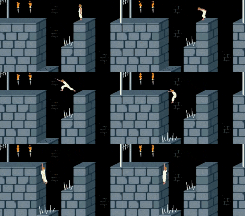
Anticipation is the sequence of movements that happens before the action we want to convey. A person jumping to get a freesby will first run towards it, lower their center of gravity by bending their knees, just before they jump towards the freesby. It would look fairly akward if a person could jump high and far from a standing position with their legs fully stretched. Anticipation allows for actions to flow naturally.
Games like "Prince of Persia" used this principle in the jumping animations.

Arc
We experience arcs when we see gravity at work. A ball thrown in the air describes and arched trajectory. It is our intuitive expectation of how things should move when they are thrown or when they fall.
Secondary action
Secondary action is your hair waving in the air when you ride a bicycle, it is your clothes wrinkling and strechting as you sit, it is the pillow giving way under the weight of your head as you lay on it.
Timing
As they say in theatre: timing... is everything. A badly timed action will come across as forced and fake, it will affect how believable it is. See the two animations above, which would you say looks more natural?
Timing can be manipulated for your desired effect, but it will look sucky when it is inconsistent. You might decide to go for a slightly more uptempo timing like the animation in the bottom, but you should then keep that same timing in other animations during the experience, inconsistency will otherwise break the illusion.
Exaggeration
Some CGI movies are so so so realistic that they are also totally boring. Hyper-realism comes across as cold and characterless, your work will lack personality. You want to have carefully crafted imperfections, exaggerating something is a good way of introducing those imperfections.
In 3D animation in particular this is hard, most animation packages are so consistent in their realism that 3D artists often have to spend a lot of effort consciously introducing imperfections otherwise the results are totally lifeless. In the section Animation past and future you can see examples of contemporary animators that work with these imperfections in order to break software's hyperrealism and create an aesthetic that is their own.
Easy in & easy out
Very few things in our daily experience move at a constant speed, normally things pick up speed while they start from a static position and slow down to a stand-still when they start from a moving position.
Easing is BY FAR the most used animation technique in UX/UI design in smartphone apps. It is sooooooooo overused in fact that you expect to see it and it has become fairly cliche through overuse.
Even creatures that to our eyes perceive as seemingly moving very slow and continuous speed are actually pushing themselves constantly, moving one little at a time.
Follow through
Continous vs. Pose to pose
This is perhaps more useful in traditional hand-made animation, in digital animation this process is called "tweening" and it is often computer generated.
Appeal (or Flair)
This cube seems to be having fun. How can have a a boring geometric object as a cube be having so much fun? There's no such thing as even a boring line if it's animated with flair.