A bit of HCI History
What follows is a very brief historical overview of human-computer interfaces that came to define in many ways the basic principles of operating digital devices that we encounter today.
The history of HCI is rich enough to actually have a full course on this, but our time together is short, so this selection isn't complete. Nonetheless I think they area important developments in the history of human-computer interaction.
Patching
This is Karen Leadley at General Dynamics in 1963 verifying a patchboard for a program in the EAI (Electronic Associates Inc.) analog computer.
The patchboard is that mess of wires that you see laying on the table. What you can see behind Karen is an analog computer that was used for ballistic calculations. Her job was to program this computer by connecting its different functionalities together with cables, using what is called a patchboard.
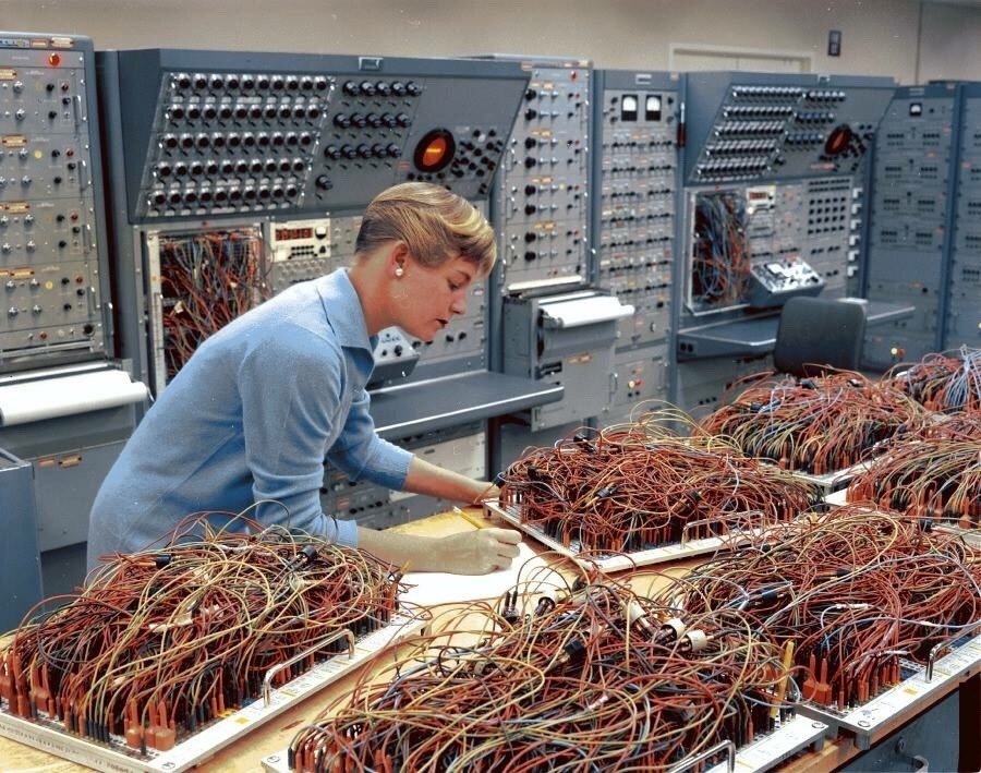
You can think of each of these patchboards as being a piece of software, they are removable (see handles). Each of these patchboards connects the different elements of the analog computer in a specific way, allowing them to work together and orchestrating their functions. A part of the machine generates a wave, perhaps a sin() function, while another integrates, and yet another can add two inputs. In a way each module in these machines is fairly dumb (like instructions in a programming language) they do not do much by themselves, it is only when you combine them in interesting ways that you start obtaining results and that's what the patchboard does and that was Karen Leadley's job, to patch together the software part of that machine.
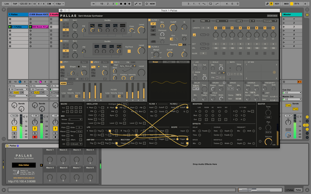
This kind of programming or patching as it's called, has actually never really gone away, it's still with us in many software interfaces (e.g. in music and sound design) and in actual physical musical intruments, such as modular synthesizers as this Synth Garden session by Leos Hort shows.
The patching metaphor is used in many different kinds of software, from interfaces in low-code or no-code tools. To workflows in specialist software such as software to route calls in a callcenter.
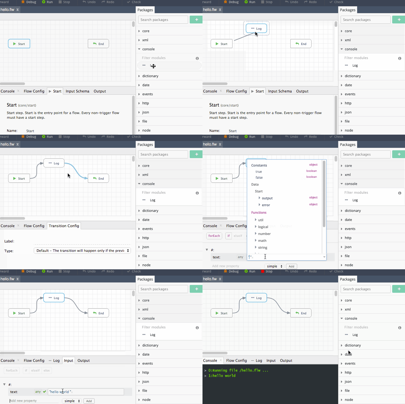
Codeflow, NodeJS app composition tool, this animation shows how to build a simple Hello World! application in Codeflow.
This type of patching is beginning to find its way into our design tools, as the needs of the UX designer grow and interactive behaviours become more and more dynamic, there is a need to be able to model these behaviours without always having to drop down to code. This is why Origami Studio (UX design tool) implements a patching kind of interface.
It isn't just coders, musicians and designers that need this, any tool complex enough to require dynamic and adaptable workflows will probably implement some kind of user-facing programming interface. This is Parabola a business processes modelling tool.
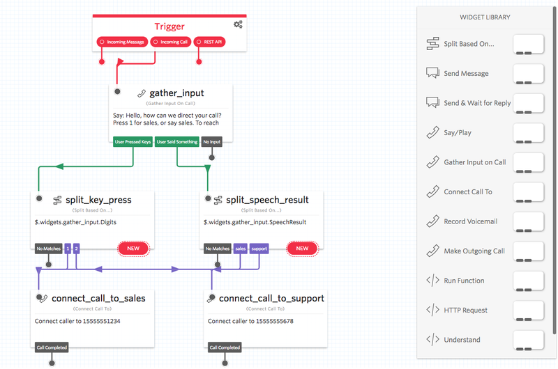
And this is Twilio, an SMS and digital telephony platform that allows you to specify the message delivery logic as a patching interface.
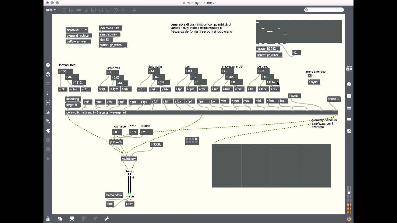
Max/MSP is widely used among sound designers, musicians, light designers and is a standard tool of the toolkit for people working in stage-related arts.
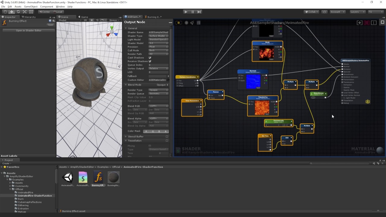
Unity's Shader Graph is also a patching or flow-based programming interface.
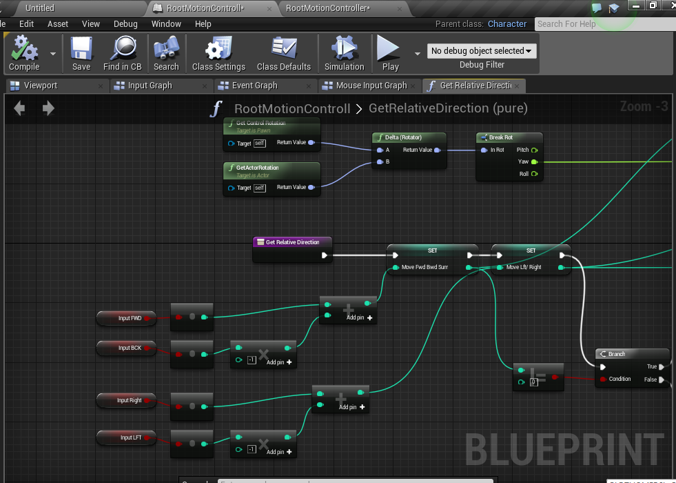
Unreal Engine also uses this metaphor for all the game logic, although in UE they call them blueprints.
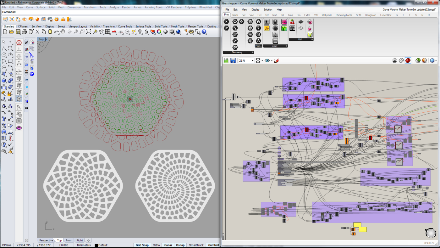
Rhino's Grasshopper beloved by architects and product designers is an algorithmic design tool that uses a node-based patching language (seen on the right) to generate geometries. As you can see the cable salads of Karen Leadley's patchboards are still very much a result of any reasonably complex program done in this kind of patching interfaces.
Seymour Papert and LOGO
LOGO was designed by Papert as a teaching tool, a way to teach children about abstractions and computation. It has some characteristics that make it particularly friendly to use. In early LOGO interpreters for example, if you mistyped an instruction and typed fowad instead of forward LOGO would say I do not know how to "fowad", instead of giving you a cryptic error message that expected you to understand its technical innards. LOGO ascribed to a design philosophy that understood that the person using it was a human being, and quite possibly not an expert, rather than a technical operator, so it gave error messages in ways that were humane and comprehensible.
LOGO had a feature called turtlegraphics that allowed you to draw on screen by using pen commands. This is one of LOGOs most endearing features as it also turned out to be a simple and graspable way of programming robots. This allowed some of the concepts that the language dealt with to be embodied physically in the same physical space as the student. One could write a LOGO turtlegraphics program and have a robotic turtle draw the graphics for you.
This is an example LOGO program:
TO tree :size
   if :size < 5 [forward :size back :size stop]
   forward :size/3
   left 30 tree :size*2/3 right 30
   forward :size/6
   right 25 tree :size/2 left 25
   forward :size/3
   right 25 tree :size/2 left 25
   forward :size/6
   back :size
END
clearscreen
tree 150
Try logo for yourself in this online LOGO interpreter: https://www.calormen.com/jslogo
The turtle that implements and embodies the turtlegraphics LOGO code.
LOGO in the classroom.
First demo of the mouse
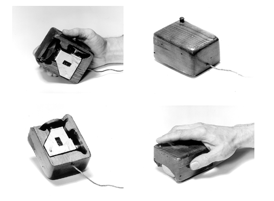
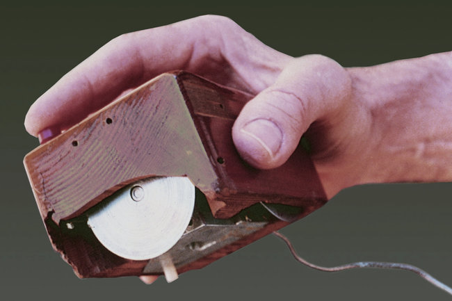
In 1968 Douglas Engelbart did a live demonstration that featured the introduction of a complete computer hardware and software system called the oN-Line System or, more commonly, NLS. The 90-minute presentation essentially demonstrated almost all the fundamental elements of modern personal computing: windows, hypertext, graphics, efficient navigation and command input, video conferencing, the computer mouse, word processing, dynamic file linking, revision control, and a collaborative real-time editor (collaborative work). Engelbart's presentation was the first to publicly demonstrate all of these elements in a single system. The range of break-throughs shown in this demo was so breathtaking that it became known as a The Mother of All Demos.
The following clip belongs to the part of the demo where Engelbart introduces the mouse.
The complete video is about 1 hour and 40 minutes and you can watch it in full on Youtube.
Here's a video of Wim Kok in 1994, then prime minister of The Netherlands and famously non-adept at computer use trying to send an email guided by a very patient younger human. On screen you can see an early version of Netscape Navigator one of the first web browsers and off-screen what you see is an unexpectedly accurate user test.
The invention of the GUI
Alan Kay joined the Xerox PARC labs in 1970 and there he was part of the team that would eventually invent the GUI and the Dynabook, a precursor to the laptop and the iPad.
The quote "the best way to imagine the future is to build it" is also attributed to Alan Kay.
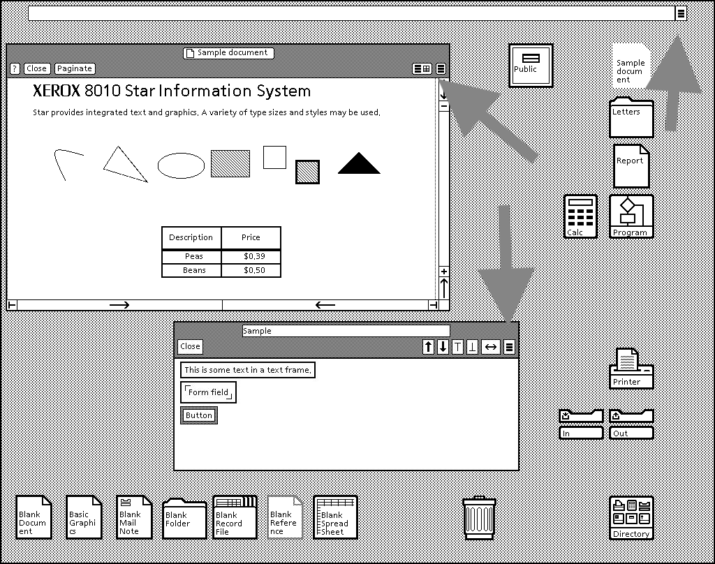
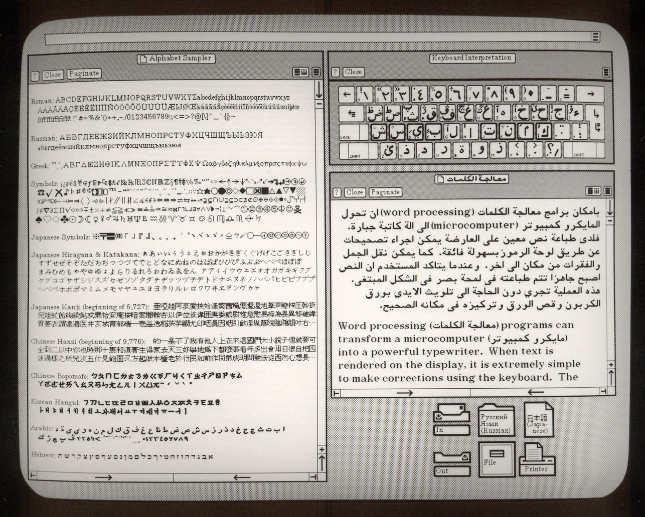
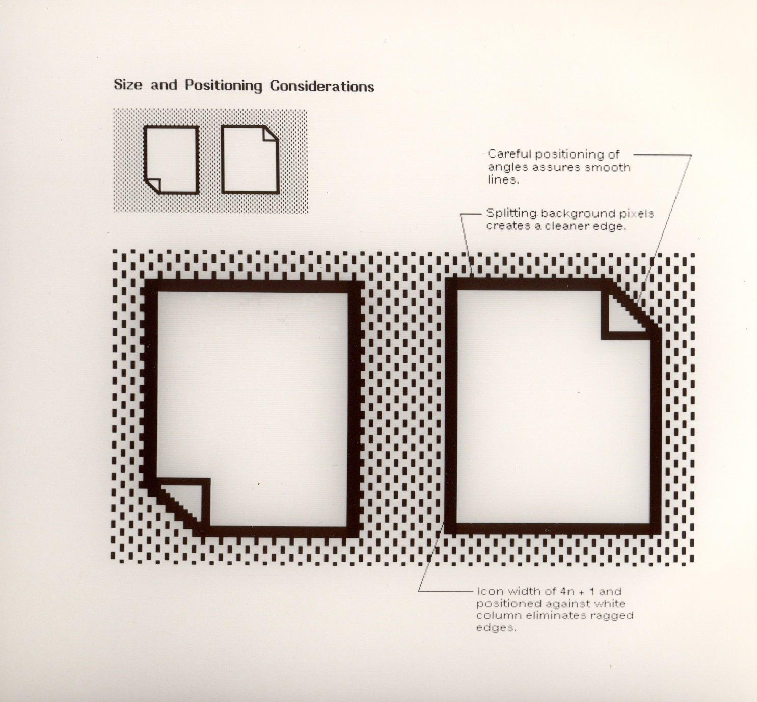
Xerox was prescient that computers might eventually take over the paper-centric workspaces of the world, so they invested hugely in being part of that revolution that few other companies saw coming. In their approach to designing the machine for this future workspaces, many of their visual metaphors were taken from the paper office. The Xerox Star had folders that you would keep on your desktop, and files were represented with paper icons. The mouse was used as a pointing device in the point-and-click interface and information was presented to the user in rectangular containers called windows. All of these metaphors are still with us today.
Xerox was fundamentally a paper-centric company, so much so that they were driven to create a kind of digital paper so that the transition from paper to digital would be as smooth as possible. Shortly after the release of the Xerox Star computer, Xerox released the first laser printer, which in turn gave birth to Postscript, which later gave birth to the Portable Document Format or PDF that we still use today.
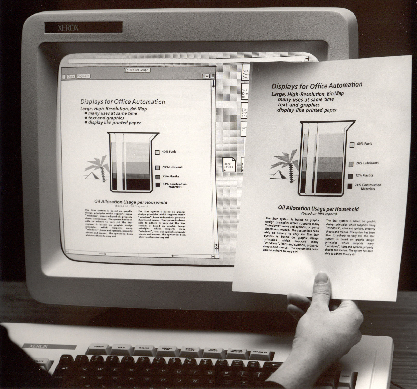
Incidentally it was also the birth of what we now call the hamburger menu.
The Dynabook
.jpg) Alan Kay holding the mockup of Dynabook. (November 5, 2008 in Mountain View, CA)
Alan Kay holding the mockup of Dynabook. (November 5, 2008 in Mountain View, CA)
Human in the loop
Apollo Guidance Computer
The computer that took humans to the moon was a custom design by NASA introduced in 1966. The AGC provided computation and electronic interfaces for guidance, navigation, and control of the spacecraft. The software of this computer was written by Margaret Hamilton, pictured here next to a print-out of the source code.
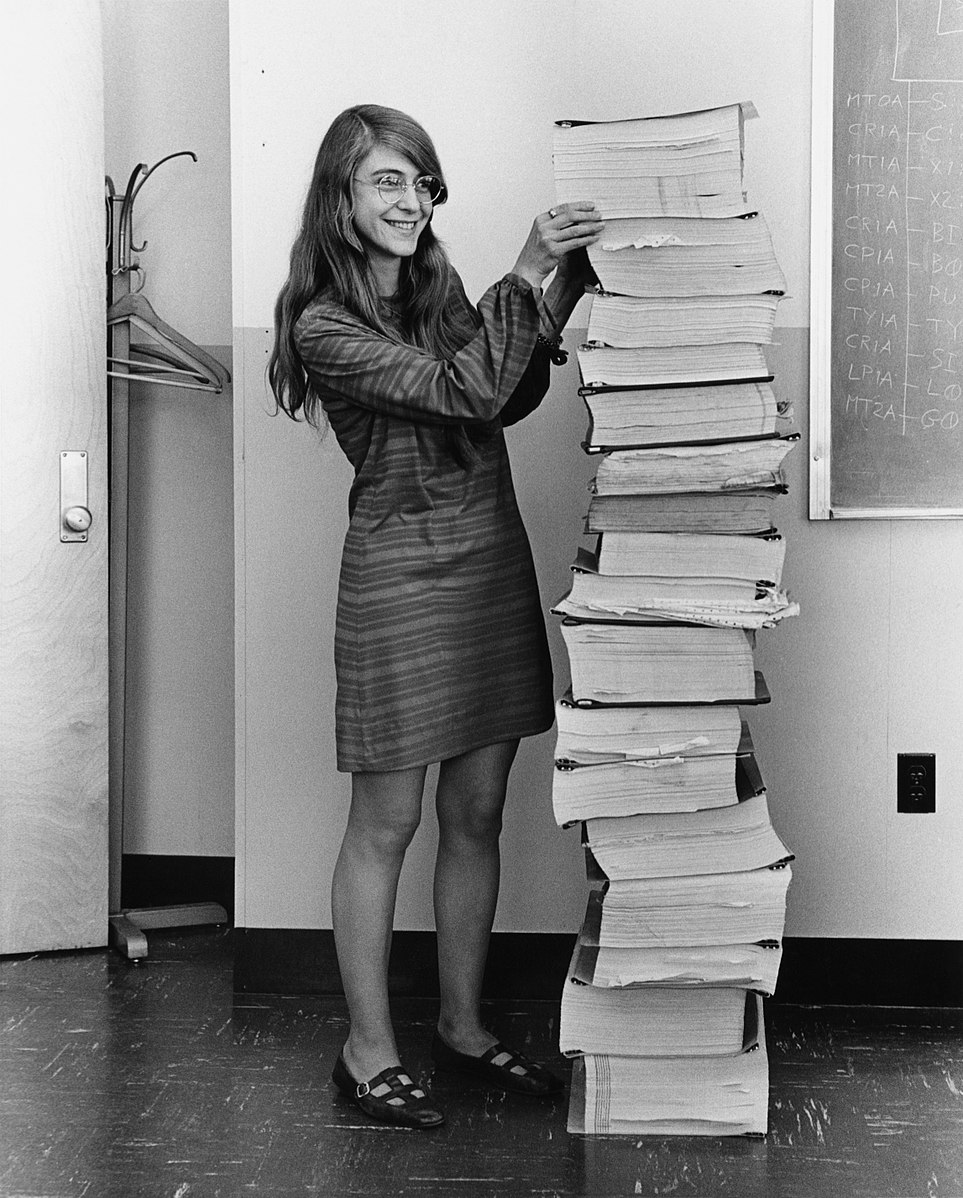
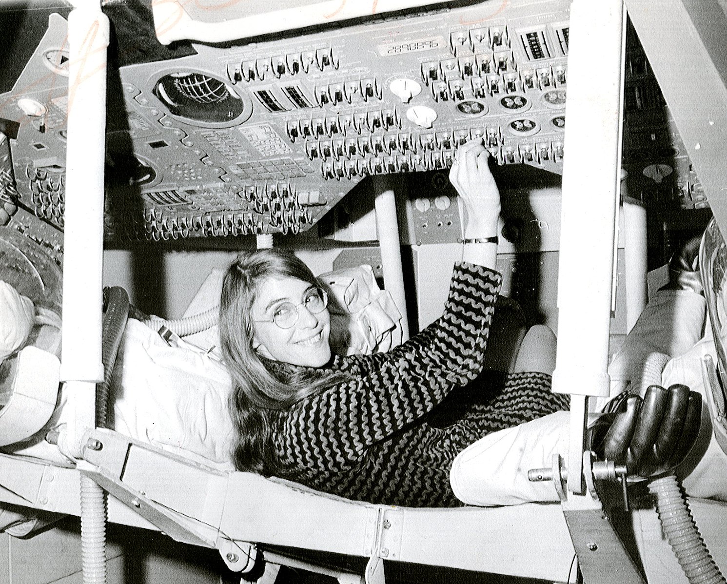
Her concepts of asynchronous software, priority scheduling, end-to-end testing, and human-in-the-loop decision capability, such as priority displays, became the foundation for ultra-reliable software design. To this day nobody has ever found a bug in the software of Apollo 11, the software worked exactly as expected. The code is available on Github transcribed from the originals on paper for historical archival purposes.
Human-in-the-loop or HITL is defined as a model that requires human interaction. It was already known at the time that fully automated systems contribute to human skill degradation (or de-skilling), so the design of the Apollo 11 on-board computer was meant to require regular interaction to keep things on track.
The on-board flight software captured these alarms with the "never supposed to happen displays" interrupting the astronauts with priority alarm displays. The screens of the on-board computer were effectively duplicated and if the informational display changed from one screen to another you knew that it was commanding your full and undivided attention.
The philosophy of HITL as a principle in systems design is not very popular with proponents of full automation, listen to the 99% Invisible, Children of the Magenta podcast for more context on what the effects of this is.
Direct manipulation
Ivan Shutherland, Sketchpad, 1963
Ivan Shutherland's PhD thesis work, Sketchpad (1961) was the first CAD program. The operator would be able to manipulate CAD drawings by using a light pointer and a set of buttons that would allow them to change modes. Observe how the person working with this interface has both hands engaged in the activity. This is slightly different from a point-and-click interface.
Alan Kay's lecture on Sutherland's work
Genesys, 1969
First animation authoring system using the Rand Tablet, predecessor of all graphics tablets today.
Baecker, Ronald M. (1969). Interactive Computer-Mediated Animation. PhD Thesis, MIT.
Immersive visualization
Ivan Shutherland, Damocles, 1968
This is a close-up picture of the Damocles augmented reality system designed by Ivan Shutherland's team in MIT in 1968.
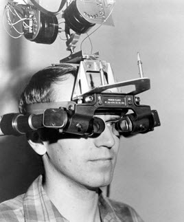
First head mounted display system, it overlaid synthetic images produced in a computer screen with real-life natural vision. This was way before VR was invented, Damocles was basically a head mounted display, but it also introduced the idea of overlaying a digital layer onto our world, which is what we would today call Augmented Reality (AR).
Here's a live demo of the Damocles head mounted display, and in my opinion the most mind-blowing 22 seconds of video to ever be released from an HCI lab.
Movement and touch
Erkki Kurenniemi was a designer, artist, electronic musician, and electronic instrument builder with pioneering work in the field of tactile interface designs and embodied machine interfaces. He is credited with having built the first digital synthesizer. He worked in relative obscurity for decades, known mostly as a musician, before the full range of his work was discovered and studied in detail in the 2000s.
There is a film by Mika Taanila titled The Future is Not What It Used to Be which deals with Kurenniemi's work. Here's the trailer:
REMBERING ERKKI KURENNIEMI: THE FUTURE IS NOT WHAT IT USED TO BE (Mika Taanila, 2002) from Spectacle Theater on Vimeo.
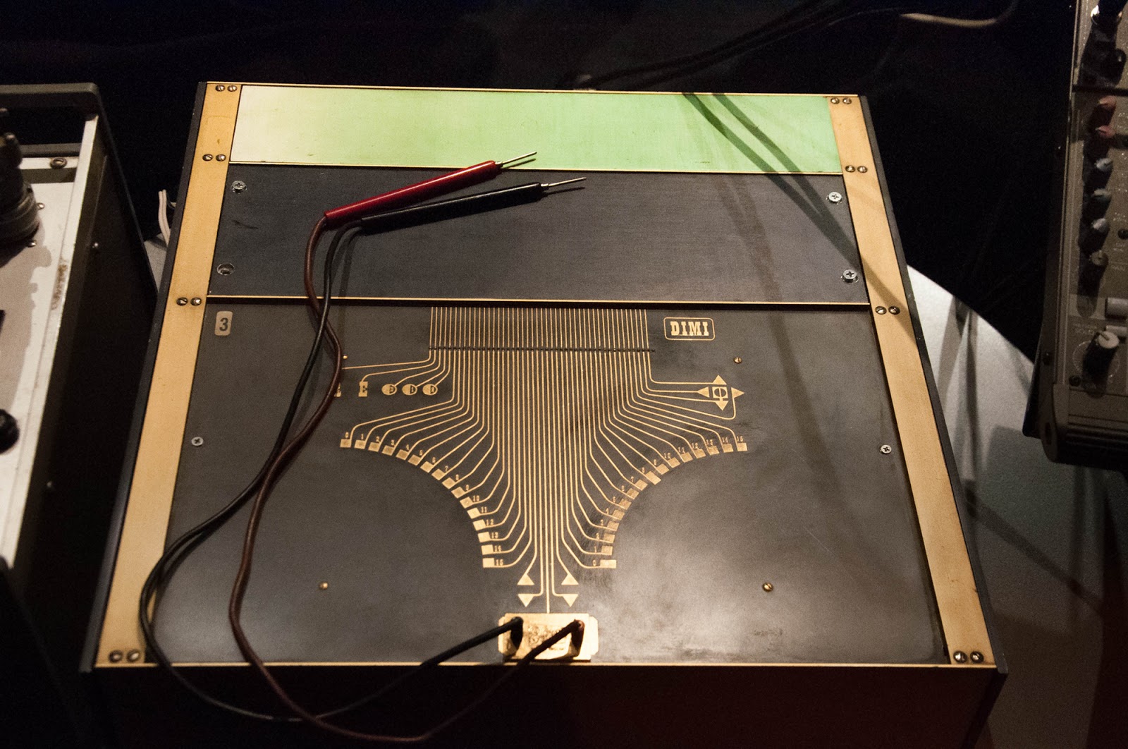
Kurenniemi's instruments were largely touch and movement activated, his vision proposes a completely different way of interacting with machines, one in which there are no symbols or icons or pictorial representations of interface elements, but rather bodily actions and habitable spaces.
Kurenniemi with his DIMI-A synthesizer.
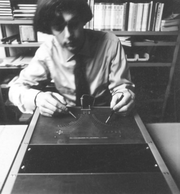
Touch-based interface of the DIMI-A synthesizer based on the copper tracks typically used in electronics.
Recommended: listen to these two podcasts
Down the rabbit hole 🐰
- The Whole Code Catalog
- History of the GUI
- Relationship between HCI, IxD and UX by Jiajing Guo
- A brief history of Human Computer Interaction it isn't quite what it promises but it does a fairly good job at identifying larger trends in the field.
- Art Lebedev's studio, released a keyboard with embedded OLED screen in its keys back in 2007, the Optimus Maximus, some 10 years before Apple released a macbook with a TouchBar
- A list of future programming interfaces Mind Bicycles
- A slideshow list of alternative programming interfaces
- Visual Programming Snapshot
- Designing for notations
- The excellent Gadget Survey
Acknowledgements
NASA and Wikipedia for the materials on Margaret Hamilton.
Some of the flow programming examples and animated gifs come from the excellent The Whole Code Catalog by Steve Krouse
Some of the text on The Mother of All Demos, from the Wikipedia article. Thanks!
Images of the Dynabook from history-computer.com. Thanks!
Podcasts on the Automation Paradox by Roman Mars and the team at 99% Invisible. Thanks!
Link-outs to readings by Bret Victor and Ink & Switch. This work is so insightful and precious! Thanks!